top of page


Home

03. Competitive Audit
Learning from others is always a good way to improve. I mainly researched from direct and indirect competitors like Newinc, Roulette, Eyevee, Harvestworks, film-maker scoop and found out some common grounds between them:
Clean and Neat navigation, Clear CTA, Understandable category and information architecture, Accessibility in fonts and in color comparison, Attractive motif banner, Reasonable layout
04. Design Decision
Feature 1. Navigation Reorganization
Feature 2 Refine the site map & information architecture
Feature 3. Streamline applications processes
Feature 4. Refresh the layout for improving accessibility
Feature 5. Refine its interaction design
Feature 6. Recreate its Logo and a Brand identity for enhancing users’ trust and marketing benefits and value.
Feature 7. Redesign it as a responsive website
1. Users could not find out the information quickly through the navigation and feel pressure about the chaotic category of navigation
2. Users feel it is complicated when they trying to apply for residency
3. Users feel IEA is not be trusted because of the chaotic visual design and inconsistent brand image
02. User Painpoints
01. Outcome
Get good feedback from the client and terrific feedback from usability testing, and the new website is developing by Engineer
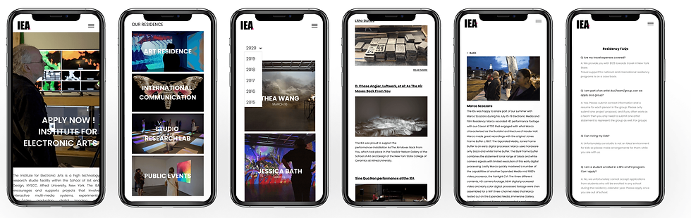
Feature 1. Navigation
Reorganize the category of navigation and combine the same category into one.

Refined Sitemap

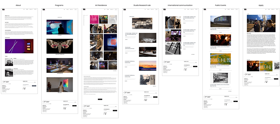
I replaced the original five-page design with a four-page design
Refresh Information Architecture

Feature 4. Interface Redesign

Feature 6. Visual Identity


05. Design System
06. Recap
-
I learned about how to build a sitemap and information architecture
-
I got iteration is very important in the design process.
-
I am aware of the significance of clear navigation.
-
I realize that visual image and brand image greatly affect users’ impression and trust of brands and products


-
I merge the "electronic media & film" and "visual arts programs" in the original sitemap into the "Art Residence" project;
-
"Schein Joseph" was classified as "international communication";
-
"Project" is classified as "Studio Research Lab"; "Projects" is classified as "Public events".
-
I set up an “About” page for collecting and showing “ team member “, “ Who We are “ “ our mission”, “ history “ information instead of showing that information with 7 pages. I
-
remove Residency FAQs to another independent page and get ride of current members category.”
-
Move “ contact “ to the footer.

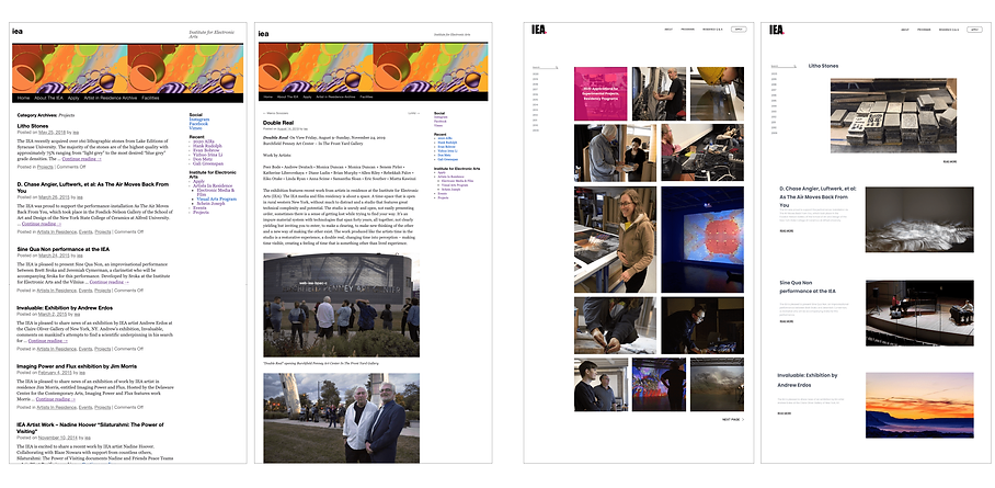
Before
After
Home Page Wireframe
Before
After

Feature 3. New Application Flow


After
Before
Before
After
Rest Pages Redesign
After
Before
Feature 2. New Site map/IA
Feature 5. New Interaction Design

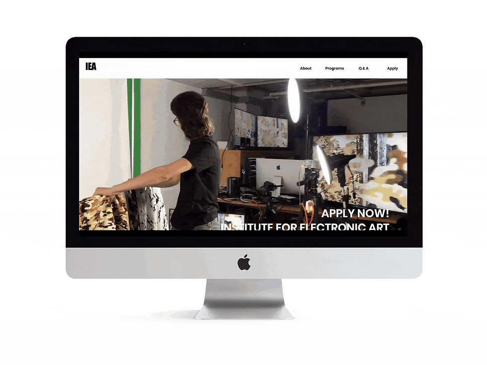
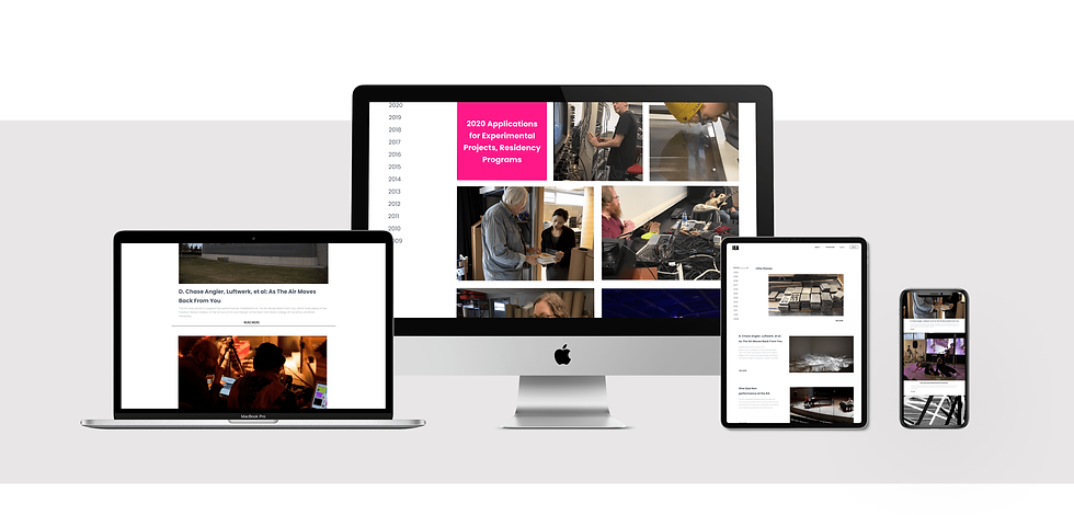
Feature 7. Responsive Design
Background
The Institute for Electronic Arts is a high technology art studio. The IEA supports art residency and projects that involve interactive multimedia systems, experimental video production, digital imaging, cultural interactions, and publications. My role was to collaborate with its engineer and PM to redesign the whole website with user-centered design and redesign its brand identity to reach their goal.
Business Goal
Raise residency application rates and increase website views and attention.
Problems
Inobvious apply information and inconvenient Apply method
Messy navigation and chaotic information architecture
Brand image lack of trust and professional
Timeline
October 2019- February 2020
( 7 months )
Team
Lead Designer
My Role
UX UI Designer, Visual Designer
bottom of page