


OOPSLINE is an AR-based social platform where users can create virtual identities, explore immersive spaces, and connect with others through experiences that blend reality and virtual worlds.


OOPSLINE is an AR social and virtual community product with a very novel experience, meaning users might not fully grasp its brand identity right away. Therefore, the design needs to transform 'virtual identity, spatial exploration, social connection, and futuristic technology' into a more intuitive and memorable brand visual language


Derived from user insights and core brand attributes, the design direction is synthesized into a cohesive visual language that guides the execution of brand identity, UI, and motion design.


Leveraging market research data, I uncovered that 70% of the audience interested in AR and immersive entertainment is concentrated within the global male demographic aged 20 to 40. I then conducted user research to deeply understand their expectations for an AR social experience, focusing on their craving for novel sensory entertainment, self-expression, a sense of exploration, and community connection.


Based on these insights, I translated user needs and product positioning into core brand keywords that guide the visual direction: Immersive, Exploratory, Youthful, Bold, Futuristic, and Y2K Style.


The mood board served as the primary tool to define the overall visual tone of OOPSLINE. I drew inspiration from futuristic technology, AR virtual spaces, Y2K digital culture, chrome/reflective textures, and youthful design trends. This process allowed me to align our core focus on 'Immersion, Exploration, Connection, Virtual Identity, and Futurism,' creating a cohesive visual signature that guides all subsequent deliverables, including the logo, UI, motion graphics, and marketing materials


Our color strategy revolves around three core pillars: futurism, youthfulness, and immersion. We leveraged highly saturated blue, purple, pink, and fluorescent yellow to drive the feeling of technology, exploration, and vibrant social energy. A solid black background anchors the immersive, virtual-space vibe, while white is strategically used to maintain text clarity and overall visual balance. This comprehensive palette perfectly preserves the futuristic identity of an AR digital product while making the brand distinctly recognizable across all marketing materials and UI interfaces.


The brand name 'OOPSLINE' combines the youthful, playful energy of 'Oops!' with the concept of connection and pathways implied by 'Line.' Its Chinese counterpart, '幻境线,' draws inspiration from futuristic linear cities and mirrored spaces, highlighting the seamless transition between the real and virtual worlds in AR. Based on this concept, I took the repeating 'OO' from 'OOPS' as the design anchor for the logo, evolving it into a folded 3D linear structure to symbolize paths, entryways, and virtual connectivity. To bring this to life, the 3D material strategy leverages a smooth, high-gloss, and lightweight finish, perfectly reflecting the product's premium and futuristic identity.


I chose SF Pro Expanded to set a clean, modern, and tech-forward tone for headers, the official website, and key information layouts. For the secondary typeface, MuseoModerno’s rounded glyphs and sense of flow beautifully capture the visual concept of a 'Line.' This combination strongly amplifies OOPSLINE’s core brand identity centered around connection, pathways, and futuristic environments


The official website serves as the primary gateway for the brand, heavily carrying the product concept, overall visual vibe, and the user’s crucial first impression. In my design execution, I integrated our core logo, gradient palettes, virtual avatars, and linear visual languages directly into the page architecture. This allows users to immediately feel OOPSLINE’s futuristic, exploratory, and immersive environment the very second they enter the site
To reflect OOPSLINE’s core concept of connecting reality with virtual worlds, I designed a tailored dual-mode experience: a futuristic, cool aesthetic for dark mode and a soft, playful style for light mode. This approach not only honors the brand's 'duality' philosophy but also gives us great visual flexibility across different product screens and marketing channels. Dark mode embodies the immersive, cool 'Mirage Space' to maximize the tech and futuristic vibe. Meanwhile, light mode brings users back to a soft, lightweight 'Real Space,' making the entire brand feel much more approachable and youthful


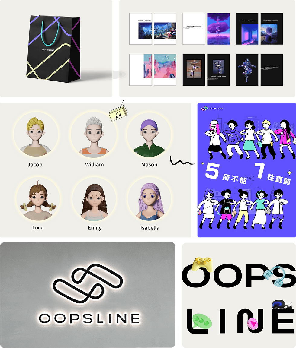
This part showcases how the OOPSLINE visual system extends into various online and offline touchpoints—ranging from product promo videos and social media channels to character identities, shopping bags, spatial signage, and marketing materials. By consistently applying the core logo, linear motifs, and our lightweight color language, we ensure the brand preserves its signature futuristic vibe and high recognition across all forms of media.


Translate OOPSLINE’s AR social product concept into a clear, perceptible, and scalable brand visual language, extending it seamlessly across UI, motion design, and both online and offline communication scenarios
