top of page


Role
Product Designer, Visual Designer
Duration
May-August, 2020
Team
Lulu, Jessica
Background
PonyCody is an E-learning platform that offers fun, engaging, gamified, and self-paced coding courses for 5-12 years old kids. I help them solve the courses low sign-up rates problem by redesign the course section and improve the professional image by independently creating the illustration system
Problems
Course sign-up rates of parents' pages are still low during the marketing campaign.
Overview


02. Affinity Diagram

Learning from others is always a good way to improve. I did the UX UI audit of PonyCody competitors like CodeMonkey, 西瓜创客,LingoKids and tried to find out the key to the subscription. The following insights are I got: Intuitive Course Journey, Clear Course Grading, Reliable Brand & visual identity, Repeated CTA Botton.
04. Competitive Audit
06. Solutions
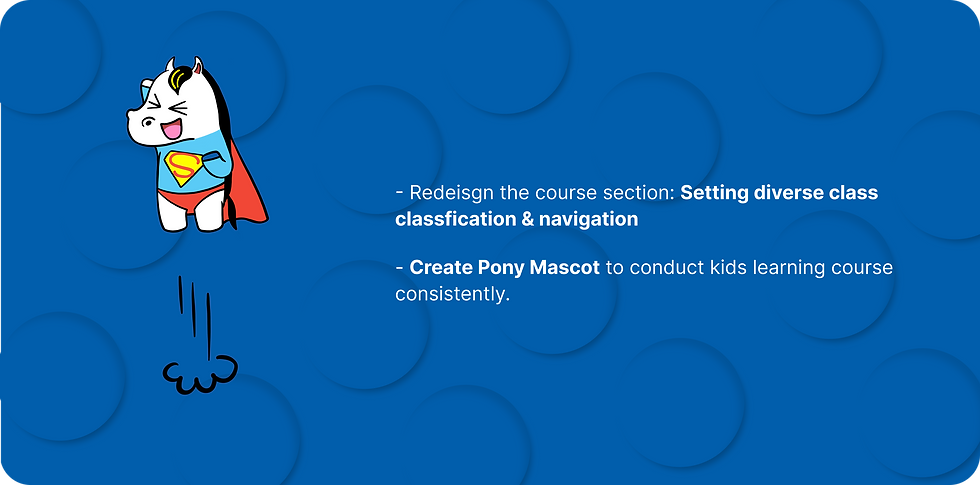
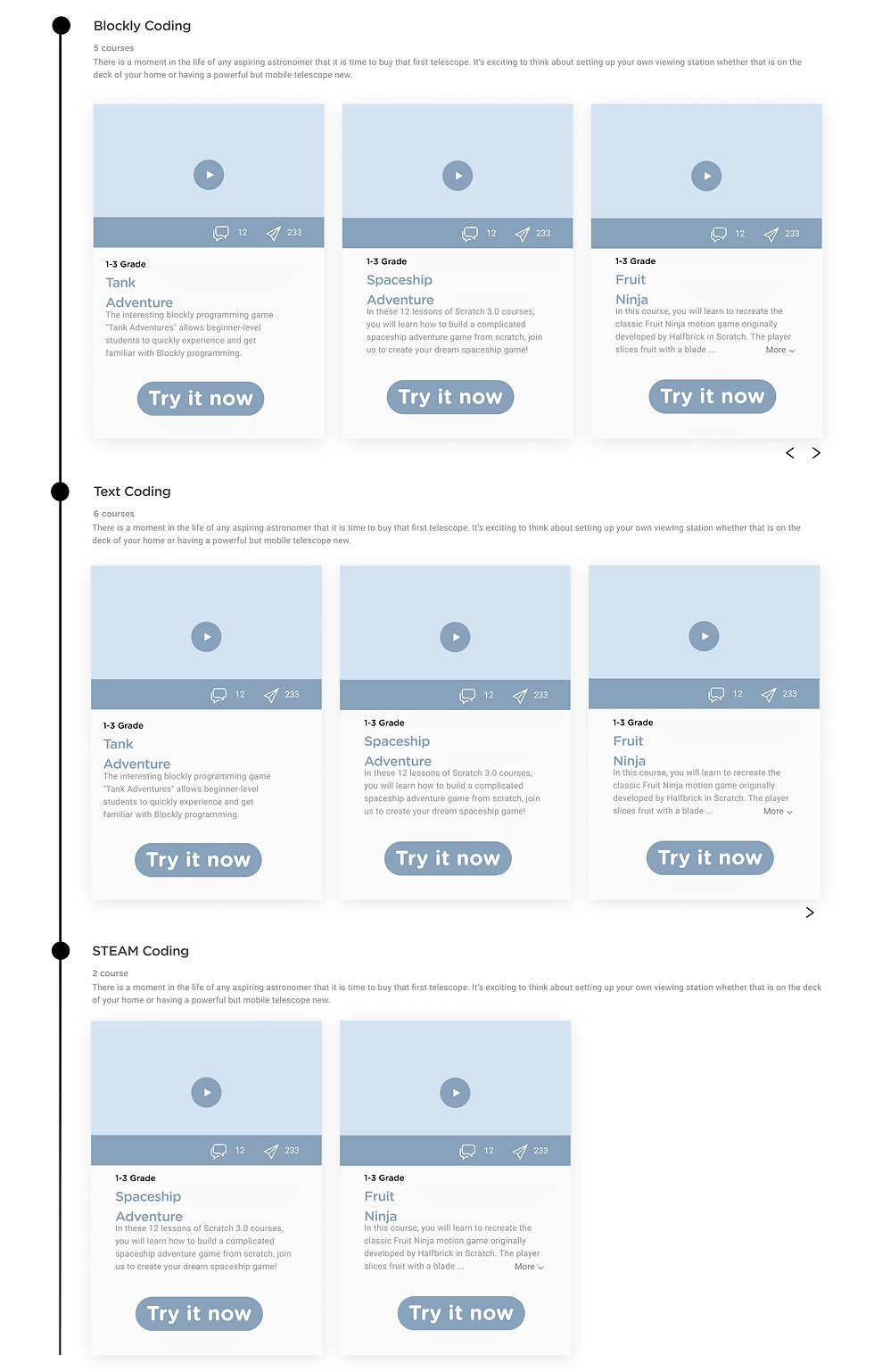
Feature 1. New Classification & Navigation
Iteration I

- Add course journey above the course intro
Pros:
- Course Journey states the difference between each level course which helps parents understand course setting better.
Cons:
- Course Journey takes more interface space that makes scanning efficiency slower.
09. Summary
1. Learned how to deeply understand a problem with diverse solutions and iteration.
2. Learned how to develop a brand mascot with an illustration system.
07. Comparison


01. User Interview
03. User Painpoints

05. Brainstorm

08. Style Guide

Iteration II
- Combine course Journey with course section
Pros:
- Improve the efficiency of the website scanning.
Cons:
- " T " Structure makes course viewing harder
Iteration III

- Set age Navigation on the left side of the course section
Pros:
- Age navigation give parens a straight forward idea to understand which level course fit their kis most.
Cons:
- This solution does not fit for mobile interface solution

- Use tab design solution instead of the left side of the course journey
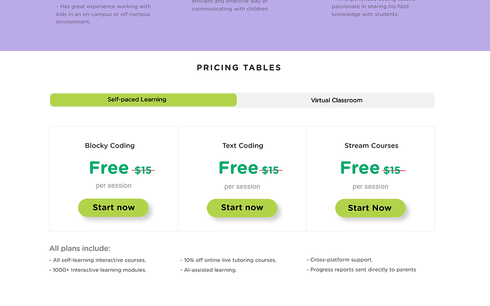
- Set diverse course classification methods :
1. Age classification
2. Degree of Difficulty classification
3. Customer reviews
- Set collar bar for saving scanning space
Feature 2. Illustration


Final Solution

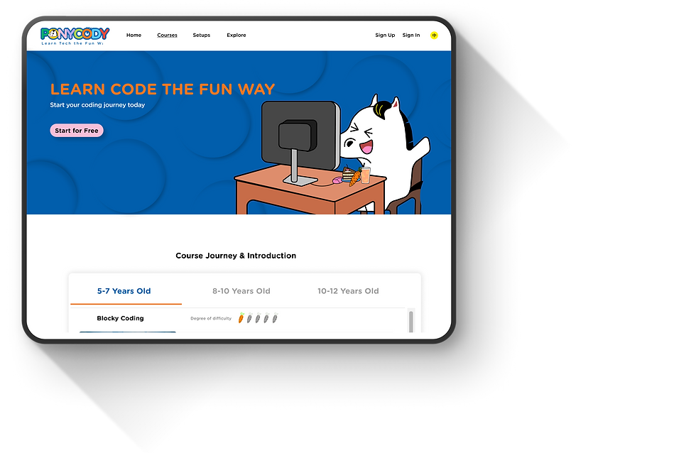
Home
The conversion rate of user sign up courses increased 20% within one month
Conversion rates feeddback
bottom of page