top of page


01. Outcome

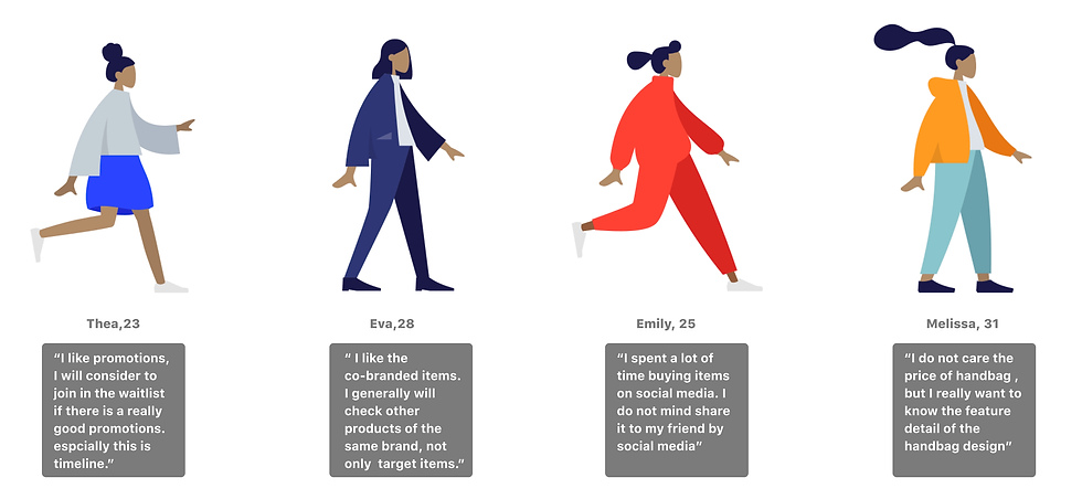
What did users say?
I interviewed 20 users who love fashion, entertainment, arts, and the high tech who are between 21-31years old, and I found out some interesting customer insights: Handbag feature display, Clear Promotion, Social Media buying, Affinity room
03. Competitive Audit
Analyzing competitors can help the designer better understand what features are most important to the campaign page. Through investigating and analyzing Staud, By Far, Senreve, Dange Dover these brands' landing pages, I find out the Handbag design feature, Product on the model, Sticky button or menu, Repeated Promotions CTA, Attractive banner images.
04. Solutions
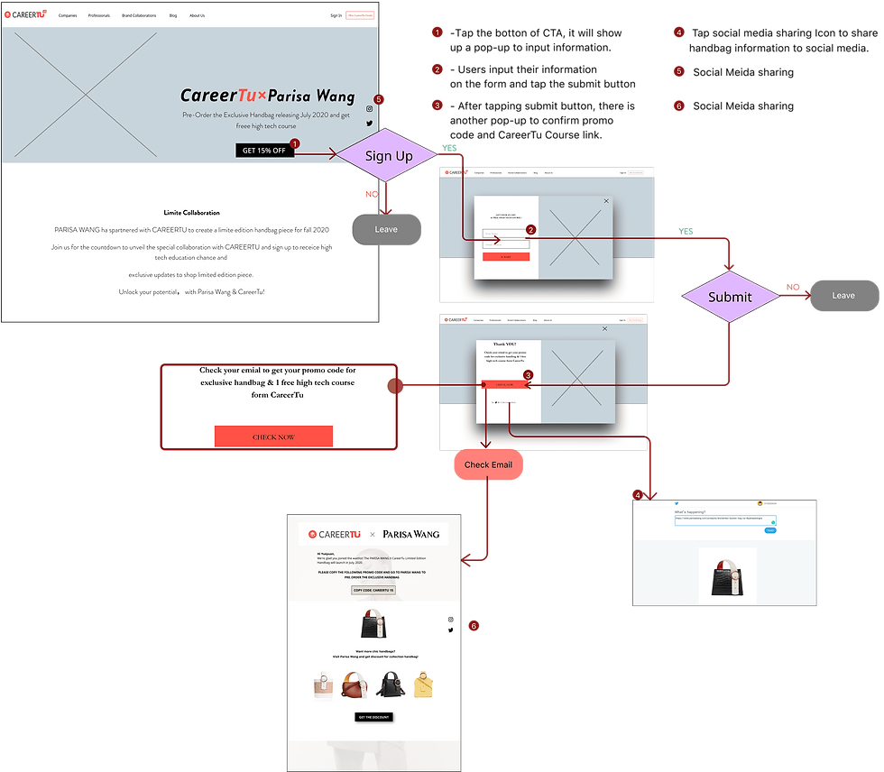
Feature 1. 3 CTA & Subscription flow
Add 3 promotions CTA on the landing page that will attract users who love promotions and interested in limited edition items. The subscription flow includes Information inputting pop-up, Thank you page, and Email Newsletter
Feature 2. Social Media Sharing
I set the social media sharing functions on the landing page, thank you page, and Newsletter to boost users into sharing referrals on social media.
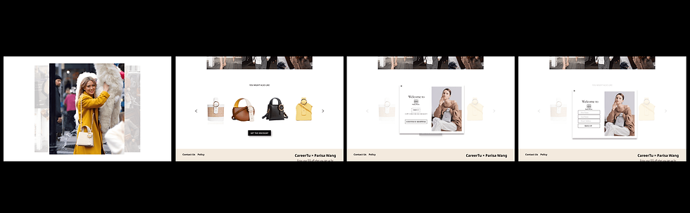
Feature 3. Handbag feature display
Create a handbag design feature section with a detailed description in the upper position of the landing page because most users want to see handbag functions quicker besides price.

Feature 1. Wireframe
Everybody likes promotions. How to make people join the waitlist? Setting repeated promotion CTA is the best way to achieve this goal. I also put multiple social media sharing links on the landing page and pop-up to improve possible sign-up.
Feature 3. Handbag Feature Display


Plan A
Plan B
Usability Testing
Most people choose Iteration II, and they think even iteration I give double handbag angles for letting people check feature description, but iteration II has better legibility in fonts.
Feature 3. Photo Retouching

05. Affinity Room
06. Style Guide

COMPONENTS

07. Prototype

08. Responsive Design

09. Recap
1. I learned about the process of creating an e-commerce landing page and the flow of landing a new handbag.
2. For an e-commerce project, refine and redesign the project based on the User problems and team suggestions gave me some challenges. I resulted in the final solution with insights from all stakeholders.
3. Because of the virtual collaboration with all team members, It enhanced the difficulty of communication. It is very lucky we choose using Zoom to having meet often which makes our conversation effective.
4. Crossover-promotion. Apart from the site credits for CareerTu courses, I suggest users who register for a CareerTu course also get Parisa Wang site credits, for example, getting a discount on the handbag.
Home

Feature 2. Social Media Sharing

Duration
February - June 2020 (5 month)
Team
Sole Designer
My Role
UX UI Designer
Background
Parisa Wang is a Fashion retailing Company, and This is a collaboration project that launches a co-branded bag for personal & professional. My role was helping to create a marketing campaign page for the handbag subscription with mobile, tablet, and web designing. I collaborated with the DM, PM to launch this project and successfully reach the pre-ordering goal
Business Goal
Raise awareness and have 1000 waitlist subscribers by the launch day and then to convert 500 subscribers to sales.
Design Objectives
-
Offer the best shopping experience to the user.
-
Make people more interested in this limited edition handbag, stay longer on the landing page, and sign up finally


Feature 1. 3 CTA & Subscription flow

Feature 1. User Flow


bottom of page